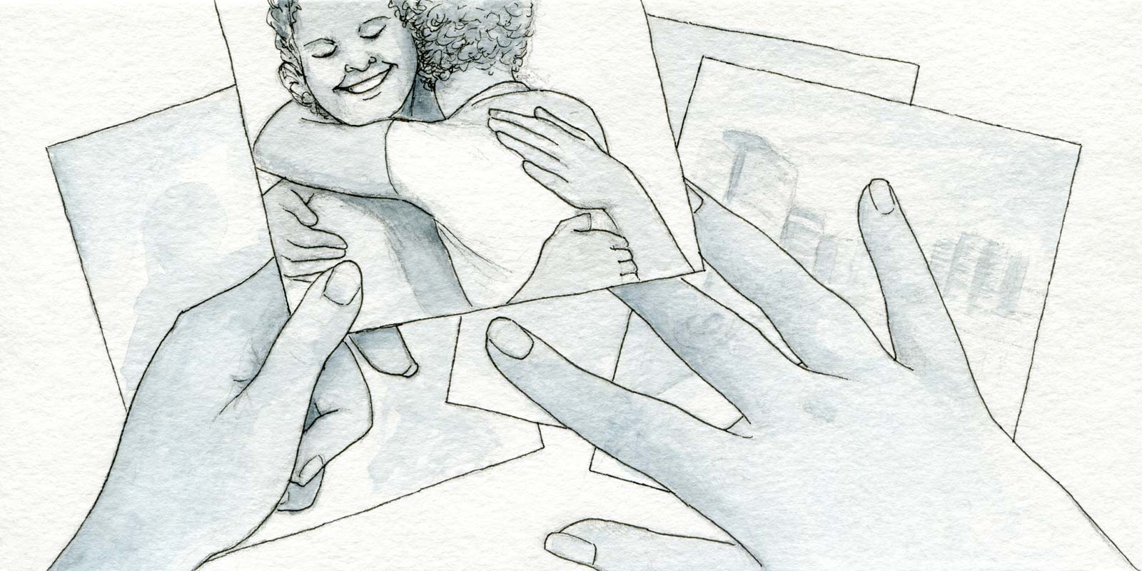
Naturally you want your product to be good, and many aspects of truly good designs aren’t necessarily obvious at a glance. No matter how well-arranged your interface is or how simple your flows are, the imagery you use in your designs will have a disproportionately large influence on how it will be received. Beautiful imagery, when done right, can be a powerful force for progress.
Making it memorable
Images can be as catchy as codenames, whether the people on your team first see your design in a presentation, a printout, or from a link in an email. They can help them recall projects even if they can’t remember the exact name or details of it, and that kind of recall makes it more likely it will stay remembered, prioritized, and ultimately done.
While you may not be the designer creating advertising or promotional material for your product, the designs you make to build it can influence their direction. If your designs look sufficiently close to the finished product, they may also get featured on blog posts, tours, and help content. Just in case an image lives on longer than you expect it do, always do right by your creative kin and start with images you can legally and ethically use. Look for approved images from marketing, properly used stock images, licensed Creative Commons images, or images you’ve made yourself.
Ultimately, nicer-looking content in designs means better portfolio material for you. That’s worth thinking about even if you’re not actively looking for a job. Anything that helps your work be seen (and advocated for) is a plus for seeking raises or promotions. Spending time on using beautiful imagery as you go makes it easier to catch the eye of people that can connect you to future opportunities, wherever they may be.
Staging it to shine
Let’s say you have an image or two that seems to communicate the thing you want in your design. There are a few easy and subtle ways to make it look right in context:
- Squint at your images and look for the lines and shapes. What stands out? Keep an eye out for these as you fit it into the way you’ve blocked out your layout.
- If there are people, look at what’s happening with their eyes and their hands. If they are looking in a direction, arrange it so they’re looking towards the thing you want to draw attention towards. Same goes for pointing, though be subtle about it. Use the same discretion you’d use for gestures in public…obvious pointing can be disconcerting, or ridiculous.
- Look for the direction of light. If you use more than one image, try to arrange them so they seem to be lit by the same light source.
- Don’t feel you need to use the whole image. Crop, rotate, and/or flip it to make an image sit nicely in the design. Things to watch out for: angled horizons (may feel queasy), unnatural light sources (sunlight coming from the bottom of an image), and things that shouldn’t be flipped (text and other unidirectional imagery).
- Try a gradient fade to screen away distracting parts of the image. It usually looks best if you only do this on one edge.
There are additional clever things that can be done with masking, selectively adjusting tone, and matching colors if you’re feeling particularly confident in your photo manipulation skills. A good image shouldn’t need to be dressed up much to work for you.
Don’t get caught up
To some degree, spending time on beautiful imagery can start blurring the lines between design and advertising. The one person you should be especially careful about overselling your design to is yourself.
Stay vigilant about the effect good images can have on your own perception. You may need to take measures to avoid narrowing your thinking to a single user or use case. You may be falling back on one type of imagery that is familiar to you, but not necessarily a good match for your design or audience. You may be misunderstanding the nature of your user-created content and make assumptions in your design that will break down in use.
Most of these potential issues can be mitigated by gathering a selection of images and getting feedback from others on your team. It’s a good way to develop a shared understanding about what makes your product meaningful. You may learn something along the way about your own assumptions.
Seek beauty, and use your beautiful images wisely.


Leave a Reply